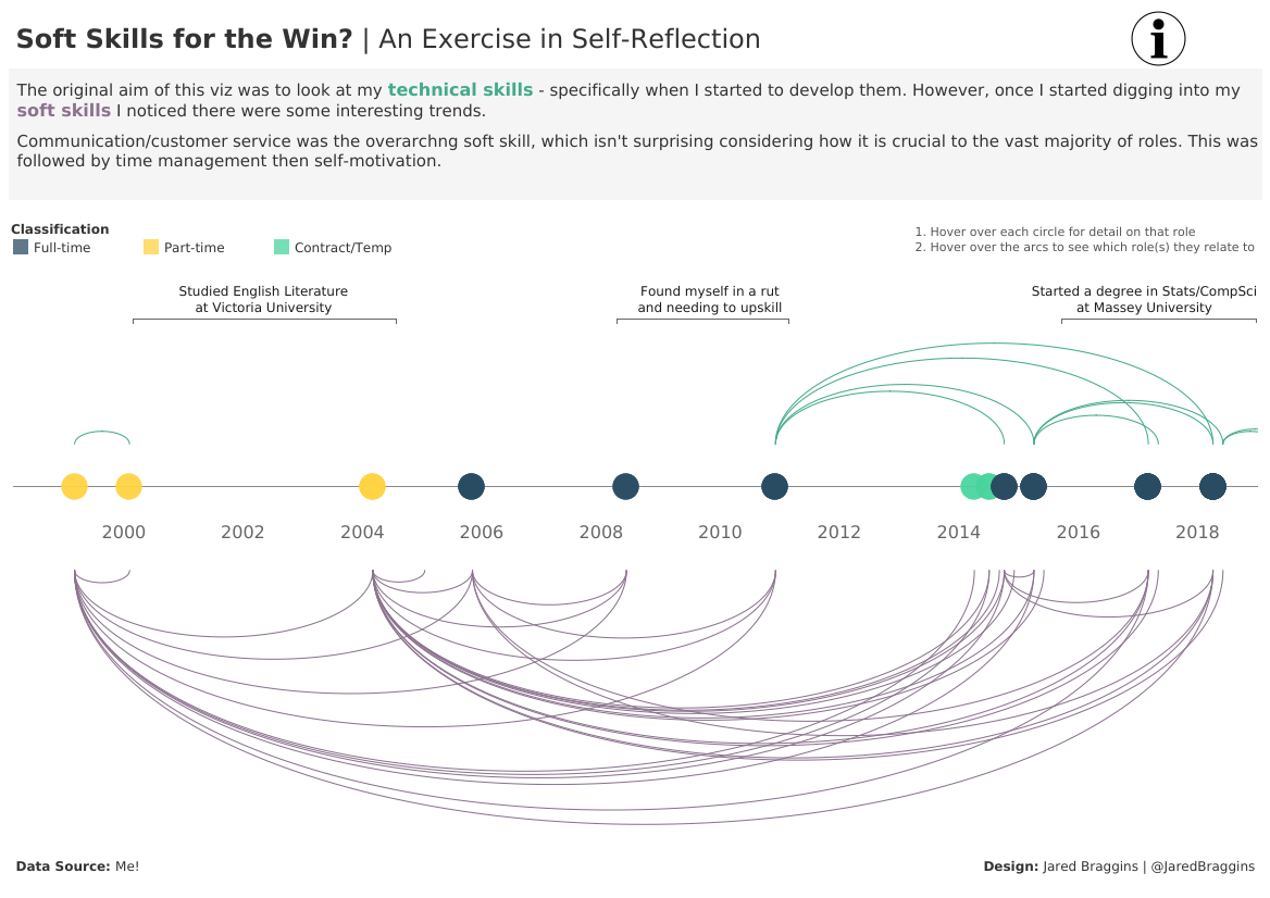
The focus of this month’s #SWDChallenge was on artisanal data.
I found this challenge to be incredibly enjoyable. Why? Because I got to design a visualisation using data that I knew inside and out (since it was about my work history after all!). But hey, that was kinda the point, right?
I want to take a step back here though. I want to address why I used data about my work history.
It comes down to imposter syndrome.
I’ve struggled a bit with imposter syndrome of late. Now, there are a few factors influencing this - some of which I will not detail here - but it has become bad of late. I’ve even considered a career change.
A major driver behind my imposter syndrome happens to be my annoying habit of wanting to learn everything at once. This has been particularly apparent with upskilling in Tableau. I’m at that point we all experience with different tools. Meaning I’m getting frustrated with trying to move beyond the basics to more advanced techniques.
So, with that in mind, I decided to visualise my work history and a) reflect on how much I’ve been progressed as an analyst, and b) push myself with a very difficult, bespoke timeline visualisation.
Here’s the end result:

Take a look at the interactive version here.
My verdict? I’m so proud of what I’ve done here. I know it can be improved upon (some of the formulas in the workbook are horrific), but I don’t care. It’s a major step forward for my skills as a data visualisation designer. Now, what to visualise next…
BONUS!
This retweet from Cole made my day

Share this post
Twitter
Google+
Facebook
Reddit
LinkedIn
StumbleUpon
Pinterest
Email