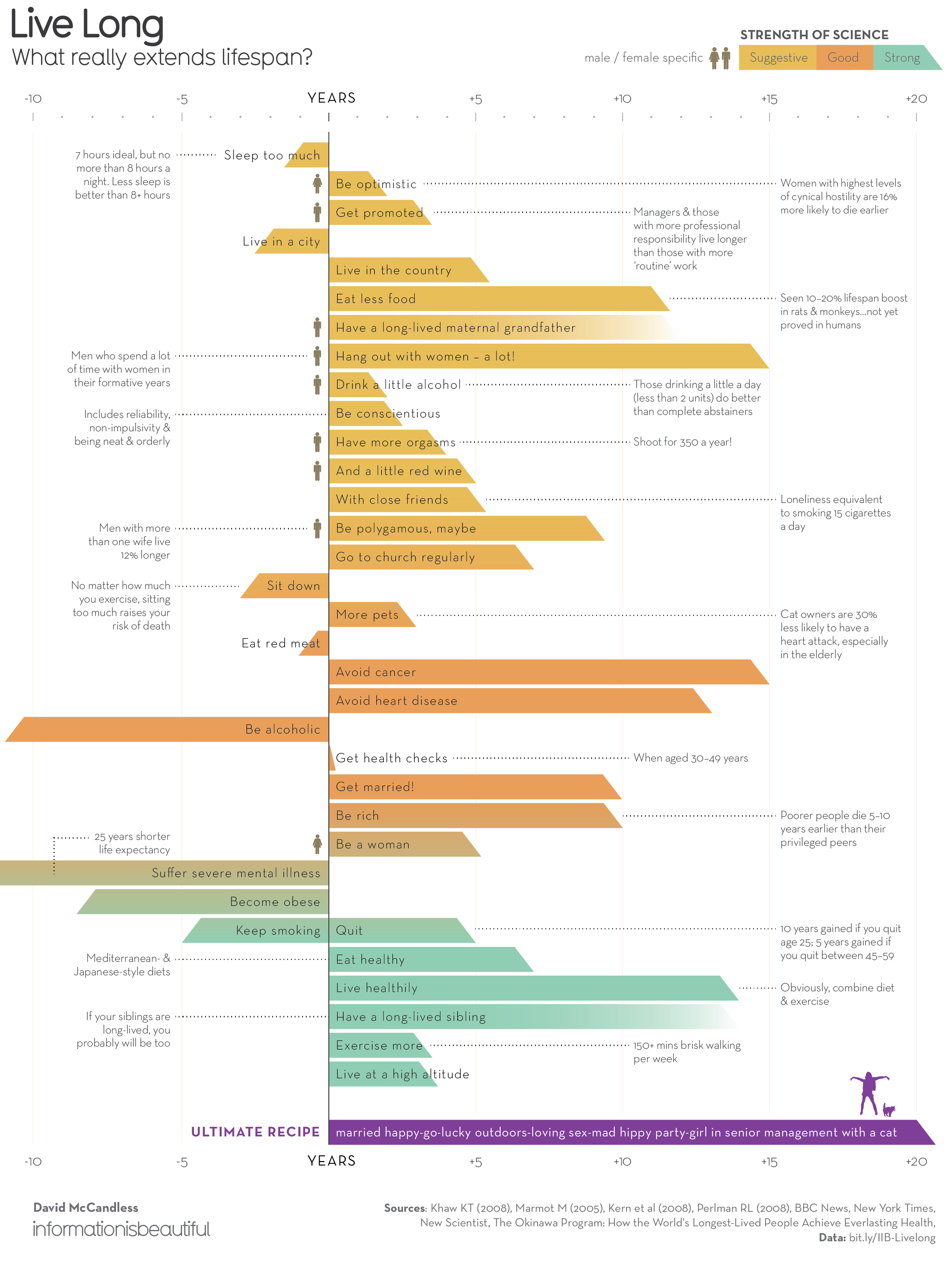
This month’s #SWDChallenge was to find a visualisation you like and emulate it. I went with the ‘Live Long’ chart by David McCandless of Information is Beautiful. I’m a big fan of David’s work. His visualisations are stunning. I even own two of his books - Information is Beautiful and Knowledge is Beautiful - which I love to flick through when I’m struggling for inspiration.
I decided to emulate the ‘Live Long’ chart because a) I wanted to make an interactive version in Tableau, and b) I saw how I could apply my own style to it.
Here’s the original chart:

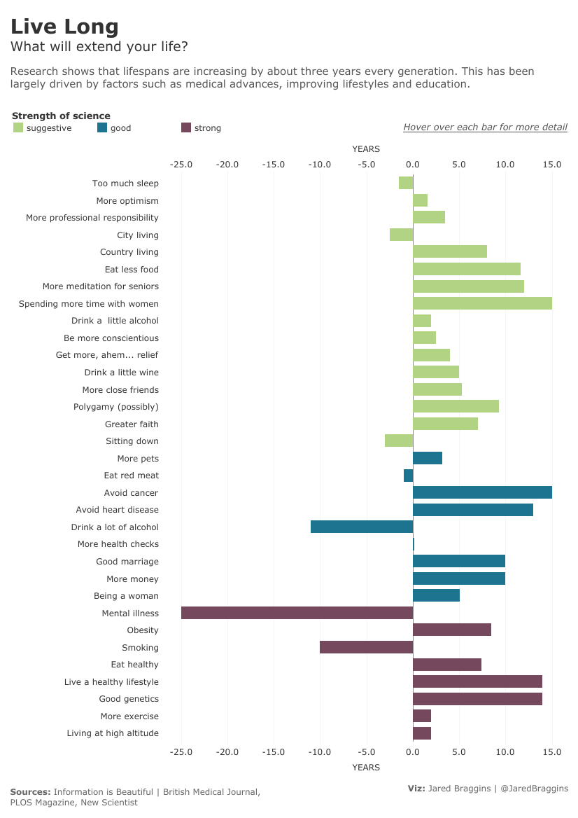
And my version of it:

Reflections
What worked well?
- In my version I removed the comments in the original viz and added them into the tooltips. This made for a cleaner layout
- I was happy with the overall design, which didn’t look like a blatant copy of the original viz!
What could be improved?
- In hindsight, I should’ve added some sort of conclusion to my viz. The original did this well by adding a final bar to the chart that outlined a ‘recipe’ for living longer
The interactive viz can be found here

Share this post
Twitter
Google+
Facebook
Reddit
LinkedIn
StumbleUpon
Pinterest
Email